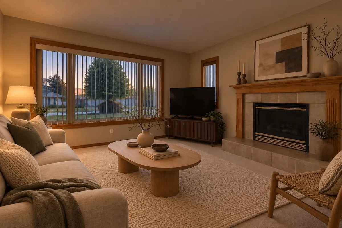
Read the light before choosing a colour
In Canada and the continental US, a north-facing window generally receives more indirect daylight than direct sun. That light often feels cooler than the light through a south-facing window. It is also relatively even, without the strong sun patches that move across many south-facing rooms.
Orientation is only part of the picture. A large, unobstructed window can make a north-facing room bright. A porch roof, nearby building or evergreen tree can make it much dimmer. Snow outside can increase reflected light; green foliage or a brick wall can introduce a colour cast.
- Look at the room in the morning, around midday and in the late afternoon with the lights off.
- Notice whether the back wall feels much darker than the wall beside the window.
- Check the room again with the lamps and ceiling lights you normally use.
- Decide when the room needs to look its best: breakfast, daytime work or evening relaxation.
Choose an undertone that works with fixed finishes
An undertone is the subtle colour direction beneath the main colour: yellow in a cream, pink in a beige or green in a grey. In cool daylight, a blue-grey can look noticeably bluer, while a soft cream may look more balanced. Start with warmth, but do not assume every warm neutral will suit the room.
| Colour family | Why consider it | What to check |
|---|---|---|
| Soft warm white | Light without a sharp blue cast | Can look yellow beside cool white trim |
| Cream or pale beige | Adds gentle warmth | May exaggerate orange-toned wood |
| Warm grey or greige | A quieter neutral | Can shift green or violet |
| Muted ochre or clay | Creates a warmer, enveloping room | Needs testing beside flooring |
Treat flooring, stone counters, tile and large upholstery as your anchors. Hold samples beside them, not just against an empty wall. A beige that looks pleasant alone can look pink next to green-grey tile. If you are keeping crisp white trim, include it in every comparison rather than choosing wall paint first and checking the trim later.
Decide whether you want light or cosy
A north-facing room does not have to be white. For an airy result, consider a warm off-white or pale neutral. For a reading room or bedroom used mostly at night, a deeper muted colour can make the low-light character feel intentional rather than unfinished.
Light reflectance value, usually called LRV, describes how much visible light a surface reflects. A higher-LRV paint reflects more of the light available, but it does not generate light. A very pale paint in a dim room can still look dull if the room lacks useful lighting and contrast.
Consider a living room with oak flooring, a cream sofa and cool white walls. A soft warm white may connect those finishes without making the room feel heavily coloured. If the same room is mainly used for evening reading, a muted clay with well-placed lamps is another reasonable direction. Neither choice depends on making the room look sunlit.
Test large samples at different hours
Small paint chips help narrow the field, but they are not enough for a final decision. Test a short list on large, movable boards. Follow the paint manufacturer's instructions for preparation, coats and drying time, and use a white border or neutral backing to limit interference from the existing wall colour.
- Start with distinct candidatesCompare a warm white, a pale warm neutral and a deeper option if that suits your goal. Several nearly identical whites can make the first decision unnecessarily difficult.
- Move each board aroundPlace it beside the window, on the darkest wall and next to flooring and trim. View it vertically, as the finished wall will be.
- Check daylight and evening lightLook in the morning, around midday and late in the day, then under your usual lamps. If possible, include both an overcast and a brighter day.
- Confirm the finalist on the wallCheck a larger area before painting the whole room. Sample paint may differ in sheen from your finish paint, so confirm the actual product and sheen where practical.
Judge samples after they have dried as directed. Wet paint and phone photos are unreliable guides to the finished colour.
See the options on your actual room
A room preview is useful for judging the size of a colour's effect: whether cream overwhelms the space, whether a deeper wall suits the sofa, or whether the trim creates too much contrast. Use a photo of your own room rather than relying entirely on inspiration images with different windows and floors.
With Renderlii, you can upload a room photo, describe the paint change in plain words and request four options of the same view. Ask to keep the flooring, furniture and lighting unchanged while comparing wall colours. The interior design rendering guide explains the visualization approach; the homeowner page covers starting with your room photo.
A render is a design comparison, not a paint match or a daylight measurement. Check every result, then confirm the colour with physical samples.
Check lighting and sheen before committing
Warm-white bulbs, commonly around 2700–3000 K, are a useful starting point for living spaces. They can make paint feel warmer at night, but they also change how fabrics and wood look. Test under the bulbs you intend to keep, and avoid judging one sample under several mismatched light sources.
Sheen changes the appearance too. A flatter finish reduces reflected glare; a higher sheen can produce bright highlights beside darker areas. Choose a finish suitable for the room's cleaning needs and follow the manufacturer's guidance, especially in kitchens and bathrooms.
- The finalist works beside floors, trim and large furniture.
- Its undertone is acceptable in both daylight and evening light.
- You like it from the doorway and from your usual seat.
- The actual paint product and sheen have been checked.
- Your choice supports the room's use rather than trying to imitate sunlight.
Questions
What is the best white for a north-facing room?
Start with a soft warm white, then compare its undertone with your trim and fixed finishes. There is no universal best white: a creamy white can look balanced in one room and too yellow in another.
Should I avoid grey paint in a north-facing room?
No. Warm greys can work well, especially with compatible flooring. Test carefully because grey may reveal blue, green or violet undertones in cool daylight.
Will yellow paint make the room look sunny?
It can add warmth, but it will not recreate direct sunlight. A strong yellow can also become intense under warm lamps. Try a muted yellow or cream before committing.
Can I use dark paint in a small north-facing room?
Yes, if you want an enclosed, cosy atmosphere. Test it with your furnishings and provide useful task and ambient lighting. Dark paint will reflect less available light, so choose it for mood rather than brightness.